

DESIGN NARRATIVE
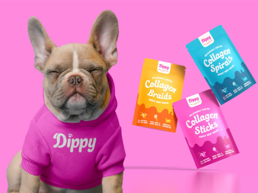
DiPPY is a fun and innovative pet brand specializing in unique, flavor-coated dog chews. The brand’s personality is playful and quirky, aimed at evoking fun and approachability.
The main components of this project, shown below, included: a revised logo unique graphics, and packaging for their first line of products.
Client Vision and Execution:
The client desired a colorful, psychedelic brand identity that reflects their values. Vibrant colors, playful fonts, and funky design elements were incorporated to capture this essence. The brand identity features a dynamic logo, punchy graphics, and welcoming fonts, enhancing the fun feel. The clients requested psychedelic, bespoke illustrations that were to mimic the dipped flavor coatings, aligning with the product’s unique selling point.

DiPPY requested adjustments to their existing logo. The logo was refined with softer corners, an adjusted ‘D’ featuring a “drip” resembling a dog ear, and improved spacing to better align with the brand’s playful and approachable personality.
CLIENT MOODBOARD:

INITIAL DRAFTS:

FINAL GRAPHICS


PACKAGE DESIGN
For the DiPPY packaging project, the goal was to create standout packaging for their Collagen Sticks, Braids, and Spirals, highlighting the flavor, shape, and benefits of each product.
Client Vision and Execution: The client wanted simple, fun, and vibrant packaging. Three labels were designed with bold graphics and a strong hierarchy of elements for consistency and legibility. Each label features specific icons and textures for product differentiation while maintaining a cohesive look. The “drip” elements were also incorporated into the packaging design, reflecting the dipped flavor coatings and enhancing the playful, heartwarming brand personality.


View More Projects Below!